Live Am Whore Yiam Truth!
I am who I am’t
If i wathen’t then why would i sthay I am’t?
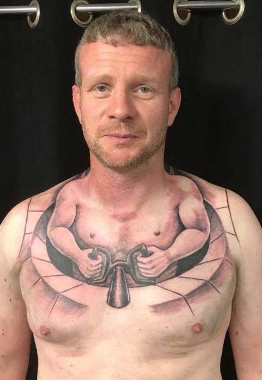
What an awful design, poorly executed. I like how it’s designed to interact with letters in the first two words but not the third. And it doesn’t like like it’s straight at all, although I’m sure where it’s tattooed has something to do with that. I often think this sub is too judgey but this is truly awful.
Removed by mod
it’s the shadow, it makes it look like it’s bulging.
…the shadow from what? There’s no shadow under the chin, so light isn’t just from above. We see a bright highlight/glare down the left side of the tattooed area. To the left of the bottom of what appears to be a bulge it’s slightly shaded, then the bulge gets bright again, then shadow to the right. It sure looks like it’s actually bulging to me.
He’s sitting on a couch. The shadow from the lamp on the end table next to the couch, which would be below his shoulder. That is why the front part of his neck is shadowed, because he’s leaning away from the camera to give it a good view of his neck, meaning he’s leaning away from the light source.
